Maty’s

Re-packaging a growing whole food health innovator
When Maty’s Healthy Products came to Haberman, the goal was clear — stand out better on the shelf amongst a sea of competitors and communicate that this brand approaches health and wellness with ingredients people can trust. As founder Carolyn Harrington states, “Real is rare these days.” In Maty’s view, everyday healing starts with ingredients people know, recognize and can pronounce. More and more consumers agree, so to meet increasing market demand, Haberman partnered with Maty’s to create a new brand identity system and product packaging.
The Work

New Brand Identity System
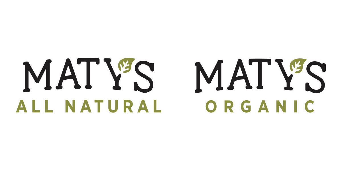
The new brand identity system established the foundation for packaging that looks right at home in the kitchen cabinet, more so than the medicine cabinet. It conveys the feeling of a grandma’s kitchen mixed with the vibe of a modern leader in natural and organic medicine. The rounded slab serif is charming and approachable, and the subtle arch and warmth of the mark convey a feeling of comfort.

Out-Of-The-Box Packaging Redesign
Previously, Maty’s product packaging featured a bottle in a box. To reduce waste, the new packaging puts a square bottle with a tapered shoulders directly in the hands of consumers. It’s a food-first communications strategy, showcasing the real foods and ingredients unique to Maty’s. Haberman created custom illustrations to showcase the ingredients — natural, trusted, reassuring even for the youngest members of the household. The illustrations can be combined to communicate the drug-free approach to healing.


GDUSA
Health + Wellness Design Award Winner
30%
New identity + packaging contributed to 30% increase in annual sales
